Caisse de Pension de l’Etat de Genève
Rebranding
© Parenti&Co
-
Scope: Identité visuelle, territoire de marque, logo, direction artistique, présentation, case study
Domaine: Caisse de pension
Date: 2024
-
Co-Direction Créative & Artistique, Approche Conceptuelle, Identité Visuelle, Supports de Communication
-
Contexte
La Caisse de prévoyance de l’État de Genève (CPEG) est une institution publique solide, engagée dans une transformation en profondeur – technologique, organisationnelle et humaine. Son image n’était pas en crise, mais elle ne reflétait plus la réalité d’une organisation moderne, innovante et tournée vers l’avenir.Challenge
Comment faire évoluer une identité visuelle fonctionnelle sans urgence apparente ? Le défi consistait à accompagner un changement de culture, à révéler les valeurs vécues en interne — rigueur, durabilité, innovation, humanité — et à repositionner la CPEG comme un acteur public ambitieux, en phase avec les enjeux contemporains.Solution
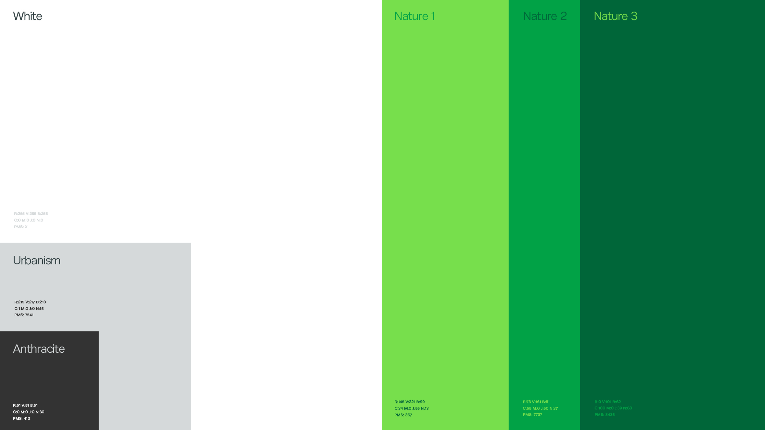
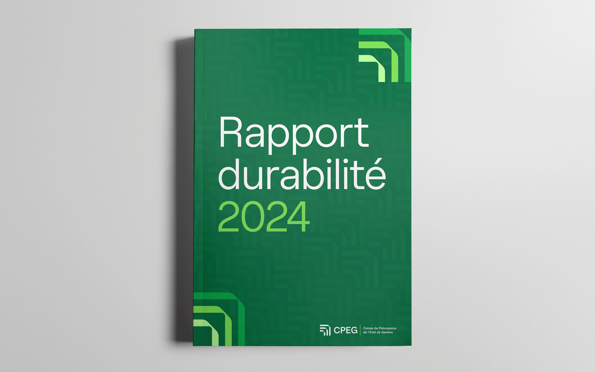
Une identité repensée en profondeur : audacieuse, structurée et symbolique. Le nouveau système visuel, centré sur trois chevrons ascendants, traduit la dynamique de croissance et de clarté. Couleurs, typographie, mise en page, iconographie et motion design ont été conçus comme un tout cohérent, pour faire de la marque CPEG un langage visuel vivant, porteur de sens et à la hauteur de sa vision.
Case study vidéo